Search This Blog

10/3/21

The Principles of Art (in Quilting!) Part II: Contrast

Contrast is one of my favorite aspects of a quilt to tinker with (aside from color).  It is the visual difference (or lack of difference) between portions of a work.  When we think of Contrast we often think about opposites in color - like Black and White.  


Make a quilt in black and white and you will have a high-contrast, highly graphic finished product.  But Contrast is more than that!  You can have contrast in texture, value, and block size.  Use varieties of those to draw attention to a certain area of the quilt.  Keep in mind, the greater the Contrast, the more dynamic your project will be.  Contrast also doesn't solely focus on the extreme visual differences...you can also use it to create quiet places, a sense of softness or calmness.  A popular style of this are the low volume quilts.    

Contrast is a good example of how it takes more than one Element or Principle to make a quilt pop.  Let's say you're making a quilt and you just fell in love with a line of blenders. You use a variety of colors but for some reason, it just looks flat - why?  Without a little bit of contrast in the prints' texture, there is little visual contrast despite the variety of color.  The quilt will still be beautiful, but it won't have very much depth as compared to a piece with a variety of textures.  

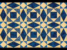
Here's a few examples of how to play with Contrast:


Do you prefer working in high contrast, low contrast, or are you more strategic?  Let us know in the comments below!

9/28/21

Backing Day is Thursday, September 30th

Here's a reminder from your friendly neighborhood Cotton Patch that Backing Day is this Thursday, September 30th! 

If you're new here and don't know what Backing Day is...

Bring in your finished quilt tops (100% complete, no more borders to add, done) on the last day of the month and receive 25% off your backing of choice, even Clearance!

The usual rules apply:

  • If the last day of the month falls on a Sunday when we're closed, then Backing Day is the day before (Saturday). 
  • Discount valid on single-fabric backings only.  Sorry, this is not valid on several cuts of different fabrics for a pieced backing.  
  • Sale prices not combinable with any other offer (this includes deals from Five Stars, redeeming points, and coupons)
  • Sale prices good in-store only on the sale day and limited to stock on-hand. 
We can't wait to see what you've created - see you on the 30th!

9/19/21

The Principles of Art (in Quilting!) Part I: Balance

 Whew! We made it through all the Elements of Art, but we're not done yet!  It's time for the Principles or Art.  The Principles of Art take all of the Elements are arrange them into compositions.  Today, it's all about Balance (isn't it always?)

Balance is achieved based on the way the Elements of Art are arranged.  By making intentional placement decisions, we can create depth, lightness, weight.  This is what we tinker with when we want to create symmetry and asymmetry. 

If something in your quilt is not looking quite right, even if your colors are just right and you have a good range of value, it's often something to do with Balance or the lack thereof.  Try rearranging your color placement - maybe there's too many of one color on one half of the quilt, or too much dark or light, or a large section is too strong.  If you're using a bright pop of color, make sure it's spread around enough so the eye moves around the quilt.  A design wall is an awesome tool so you can step back to see your quilt as a whole.  

Here's some examples of well balanced quilts and images - note that the sizes and shapes don't have to be the same to great a good sense of Balance!


Different ways to balance a quilt appeal to different eyes.  Sometimes it's about use of pattern, space, color, proportion (we'll get to that one!).  How do you balance out your designs when you notice Balance is off in a way you don't love?  Talk us through it in the comments below!

9/7/21

The Elements of Art (in Quilting!) Part VII: Texture

Texture is such a fun element in quilting.  You use this all the time, often without really giving it intentional thought!  Texture is the either visual or physical feeling of a space, and obviously is very important in quilting since we can have it both ways.  Texture can be implied visually through the use of line, color and value, like we see in landscape fabrics.  

Think about all the wonderful woodgrain fabrics.  Or the tweed prints where you just swear it looks like it should feel...tweedy...but when you touch it, it doesn't (which is just how convincing that visual texture is).  But then we have flannel. Minky. Wool. Silk.  All of those give very different visual and physical textures.  

We often hear very strong opinions about mixing fibers and textures in a quilt and sure, there are considerations to be made when mixing fibers, but to this day we have yet to have the Quilt Police rappel from the ceiling and cite us for mixing fibers!  Can you applique cotton onto wool, or vice versa?  YES!  What about tossing a flannel into an otherwise regular cotton patchwork? Absolutely!  Just be mindful of stretch and shrink, as those aspects do differ between fibers.  

One of the places we see this most is in crazy quilts.  There's ribbon, a huge range of fabrics, embroidery, beads - you name it, it's probably been in a crazy quilt.  Raw edge applique provides more texture than a blanket stitch. There's so much more!  Below are just a few examples:


Would you ever mix textures in your quilts?  Why or why not?  Let us know in the comments below!


8/29/21

Backing Day is Tuesday, August 31st!

Here's a reminder from your friendly neighborhood Cotton Patch that Backing Day is this Tuesday, August 31st! 

If you're new here and don't know what Backing Day is...

Bring in your finished quilt tops (100% complete, no more borders to add, done) on the last day of the month and receive 25% off your backing of choice, even Clearance!

The usual rules apply:

  • If the last day of the month falls on a Sunday when we're closed, then Backing Day is the day before (Saturday). 
  • Discount valid on single-fabric backings only.  Sorry, this is not valid on several cuts of different fabrics for a pieced backing.  
  • Sale prices not combinable with any other offer (this includes deals from Five Stars, redeeming points, and coupons)
  • Sale prices good in-store only on the sale day and limited to stock on-hand. 
We can't wait to see what you've created - see you on the 31st!

8/24/21

The Elements of Art (in Quilting!) Part VI: Form

Form and Shape are close, close buddies and often find themselves overlapping.  Form is the physical, three dimensional shape of the piece, or the effect of three dimensions on a two dimensional surface. Where to the eye a basketball is a circle, to the hand it is a sphere. That's really the basic differentiation.  

MC Escher was a master of using Shape and Form together in the same piece visually.  You see the shape of the arms on the paper, but the hands have taken three-dimensional Form.  


Form takes Shape a step further and determines size and function too.  For a quilt, it is a very important thing to consider - does it need to be large enough to fit a California King bed, or is it just meant to hang on the wall? How much loft do you want to your batting? Are there any three dimensional additions to your quilt, changing it's Form - buttons, ribbons, Trapunto, folding? Do you want certain blocks to jump out that the observer, appearing three dimensional?

A tumbling Block quilt is a great example of visual form, and Art quilts are famous for incorporating three-dimensional forms to the work.  Here's some good examples of Form in quilts:


Have you ever made an art quilt with 3D components?  What would you use to give your quilt and added layer of Form?  Tell us about it in the comments below!

8/10/21

The Elements of Art (in Quilting!) Part V: Shape

This week is short and sweet and all about Shape.  Shape defines the visual delineations of an object, and is determined by line or color. A shape is always two dimensional, and can either be geometric (with straight sides) or organic (with curved or irregular sides). To the eye, the outline of a basketball is a circle, the outline of a door is a rectangle, and the outline of a leaf is a variable, organic shape that is characterized only by that species of plant. 


Quilters use shape when deciding how they want their quilt to look - do they want their quilt square, rectangular, octagonal, square with rounded corners, circular, rectangular with scalloped edges? Shape is very closely related to, and often dictates, Form (which we'll look at next time in more detail!). One of the most common ways we see this is with scallops.   


But one of the fun things we can do is disrupt the shape - this is one of my favorite examples:

We can also create shape within a quilt by messing with our seams and lines to trick the eye into seeing shapes which aren't actually there.  A great example of this is the traditional Storm at Sea setup.  See how it looks like there's curves in there?  There's not! It's all straight lines at angles which trick the eye into thinking there's curves.  

How to do you like to play with shape in your quilts? Have you ever tried a scallop or beveled finish?  Share in the comments below!