Search This Blog

Showing posts with label Color Theory. Show all posts

2/22/22

How to Get Out of a Color Choice Rut

Here is something we hear at the shop at least once a week - "I'm no good with color."  Choosing colors can be daunting for some at the best of times, but what about when we get stuck and don't know what direction to go at all?  There's little more frustrating than having a pattern you really want to try but being at a total loss as to what to put in it, or just not feeling excited about the colors you've got.  Sometimes we really want to think our first choice will be the best choice, but that's not always the case.  Dead ends happen to the best of us no matter where we are in our quilting journeys.  Here's a few tricks to try to get out of that color choice rut.     

What's Your Favorite Color?
Here's an easy one - start with your favorite color!  It's hard to get excited about a project when you're working in colors you don't love.  Sometimes it's unavoidable - we have to get a project done in someone else's colors who may have a wildly different palette than what we like.  I know I've made a few baby quilts that really made me go ho-hum, and I can honestly say though small, they were a struggle to get through.  I just couldn't get excited about the colors in front of me.  But starting with your favorite color as a focus is a great way to start off on the right foot.  Root through your stash to find a focus piece in your favorite color, and go from there.  This is a great time to dust off the ol' color wheel to see what some good contrasting colors might be.

Start with a Print
Maybe you aren't the kind of quilter that frames projects in terms of color.  Maybe you're more about prints and patterns.  Honestly, it's not much different than seeking out a favorite color.  Choose your focus print or border print first, and use it as a tool to pick the rest of our colors from.  Be attentive to the dominating color and the various lights and darks.  The selvedge shows the colors used in a particular print and can be a great reference to choose colors from.  But remember - they don't need to be exact matches!  There's a time and place for exact matches, but especially with busy prints, often close enough is good enough.  Consider the fact that fabrics will be cut down to a smaller size, and your colors will be separated in different places.  Some colors will never actually touch in a quilt, so you can get away with "close enough" without issue (and a whole lot less stress). 

Check Out Color Stories That Convey a Feeling
What if you don't have a particular color or print in mind?  What if you're looking for a vibe instead?  Looking at color stories online can be a perfect starting point to getting to the feel you're looking for.  This method can be used for any quilt style but is especially helpful for choosing a color palette for art quilts.  A lot of the major paint manufacturers, surprisingly enough, have color story pages you can look through - here's a great example from Fusion Mineral Paint. These colors can translate easily into fabric and into a quilt.  

Use a Reference Photo
Think of your favorite picture.  What is it that you like about it?  Often people will think about the subject of the photo, but there's more to that picture than that!  Consider the colors in the photo drawing you in.  You can absolutely build a palette from a picture.  Check out Coolors to upload a picture and tweak your own palette, or head to Canva's Color Palette Resource to see some pre-made palettes (or to search for your own).  You might also start saving pictures when you stop and marvel at how pretty it is to use as color inspiration for later.  

Find Inspiration in Music
Sometimes we find inspiration in some unlikely places...like hearing a song, and having a color way pop into your head!  This happened to me the other day - I'll share a little more in an upcoming post - but a song from one of my favorite bands filled my mind with images of growth and spring as I struggled to choose fabrics for a new project.  Before I knew it, I had pulled everything I needed from my stash.  If you would have told me at the start that a particular song would have inspired the colors of my quilt, I would have said "yeah, sure." Whelp...cut to me eating my hat, because that's what happened.  So if you are super, super stuck, through on some tunes and give them a good, close listen.  You never know what will come up!

Fashion & Wedding Trends
When in doubt, the fashion world is a reliable resource for colorways that are on the rise and that have been popular in past years.  Look up Fashion Week and take note of the colors.  Every time the high end designers put out their lines for the seasons, you'll see a definite color trend and color pairings.  Likewise with weddings - certain color pairings for weddings go in and out of style.  A few years ago, peach, mint, and gold were the thing.  They may not be the in thing now, but if you like peachy tones then maybe that's a pairing to explore!  

Consider Pre-Cuts
If all else fails, let the manufacturers lead the way.  When they put out fabric lines they often have some kind of pre-cut offering.  Choose a line where you like the colors, and grab a pre-cut.  Other than maybe a background piece, the colors are done for you!  That's the great thing about the lines...if you don't want to have to choose a ton of go-withs, you don't have to.  Pre-cuts are a great solution for those scenarios.  

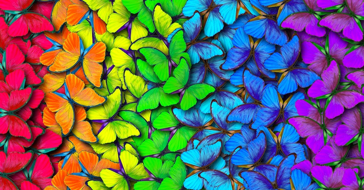
Monochrome - Always in Style
Monochrome, in both fashion and in quilts, is a classic that simply never goes out of style.  Rather than focusing on a variety of colors, you choose one color and then work in its various tones, tints, and shades.  With Monochrome, it's all about value instead of color.  Working in values presents its own challenges, but you only have a single color to worry about.  If you struggle with discerning values (we all have those moments!) using a red lens or taking a grey scale picture on your cell phone can really help to suss out those tricky shades.        

When in Doubt, Walk Away
At the end of the day, sometimes the best thing to do is walk away and take some time.  Sometimes when we sit there and stare down colors we're not wild about and spend exhaustive time trying to force a color scheme to emerge, it's not actually going to get us anywhere.  We get frustrated, our brains get tired of dealing with it, and we're just over it.  At that point, there's no reason to keep at it. Come back in a little bit or the next day and look at what you have with fresh eyes and a fresh mindset.  Maybe you come back and you love what you have!  And then again, maybe not, but after a little time away you'll be reinvigorated to get back in it and find another colorway that works better.  

What tips do you have to help with choosing colors and getting yourself unstuck?  Let us know in the comments!

6/29/21

The Elements of Art (in Quilting!) Part II: Color

 This week's Element is a familiar one...Color!  But in our Color Theory series we talked abut the kinds of color, and color choice considerations, but it's more than that.  

Where you choose to place your colors can make a word of difference.  Sometimes, finding a 100% exact color match in a print you're working with is far easier said than done...especially if it's an unusual or older palette.  If you find a "close enough" match, sometimes placing it some distance away from the focus is all it takes to trick the eye into seeing a match overall (even if it's not perfect).

Color is also a good tool to accomplish some of the other elements and principles.  Want to move the eye around? Throw in some yellow.  Want to evoke feelings of calmness and tranquility?  Focus on cooler colors.  Do you want to draw attention to a certain feature?  Use a complementary color to make that feature pop.  

Here are some beautiful examples of using color with purpose:


What's your favorite way to use color?  Add your comment below!


6/3/21

Color Theory, the Series! Part VII: Making Color Work for You

Choosing color for your quilt doesn't have to be a scary or overwhelming experience.  Over the last six editions of this series you've learned the basics of Color Theory and have some good foundational tools in your "Color Choice Toolbelt." Thankfully, fabrics are pretty easy to audition and swap in and out as you want to!  

A good rule of thumb is to start with a focus fabric that will be prevalent in your quilt, from which you can choose accompanying colors. Sometimes it's obvious which colors you want to put with your piece...but sometimes? Not. So. Much. 

Look, I'm not the Queen of the World (yet...) so I can't tell you how to manage your quilt making process but I can offer some things to consider.  These are some broad brushstrokes, so keep in mind there are always going to be exceptions, but these are some good places to start:

  • What kind of fibers will you be working with - cotton, batiks, flannel, wool, silk, wovens, etc? This is important to consider since some fibers absorb dye differently. Batiks and cottons tend to be more saturated with dye, and so they run the gamut from pastel to bright to dark with ease. Flannels can be bright, but more often than not you'll find darker, more muted colors or very soft pastel colors. Wool comes in all colors, but darker and brighter colors are more prevalent. Wovens tend to be more neutral and tonal. 
  • What do you want to achieve with your quilt? That will help determine your color selection. If you are looking to make a comfort quilt, you might shy away from the brighter, more intense colors and opt for something softer and more soothing. If you are looking to do something more contemporary, you might look more into the brights and tonals. If reproduction is your thing, you might seek out more shades and tones. Pastels are more suited for shabby chic, spring and baby quilts, so you might consider pastels for something like that. 
  • THERE IS NO HARD AND FAST RULE AS TO WHAT IS THE "RIGHT" COLOR FOR THE JOB. I cannot emphasize that enough! I follow a lot of quilt groups online and there are a whole lot of opinions about what the right and wrong color and style choices are, so mine is just one more opinion in the sea of opinions...but there are no Quilt Police that will haul you away for doing a baby quilt in tonals, a reproduction in pastels or a traditional quilt in brights. Consider who you're making it for, and what they like and what purpose it will serve. Everyone has a different eye and likes different things so COLOR CHOICE IS SUBJECTIVE. Color Theory helps you get to the place you want to go with your color choices.  

As we talked about early in the series, colors evoke certain feelings and ideas. Google search "color meanings" and you'll find all kinds of things!

Note, we at The Cotton Patch are not psychologists...and not totally sure this is actual psychology.  But, you get the idea.  Colors evoke feelings and meaning universally (though the meanings may vary by time period and by culture...you get the point.)

Here's a high level breakdown of colors and the effects they achieve on their own. When you combine them in certain ways, they bounce off each other differently:
  • Red: An active color, red will pop out from darker, cooler colors. It has warm intensity.
  • Orange: Also an active color, it pops from darker, cooler colors as well. It is bright and gives quilts an energetic feel.  In its shades, rust lends a quilt a lot of warm richness. 
  • Yellow: An active and intense color that will pop against any other, even warm colors. It is warm, crisp, and vibrant. The eye cannot focus on yellow for very long, so placing pops of yellow in a quilt forces the eye to move around the piece. It also gives quilts a cheerful and sunny feel.
  • Green: This is generally a more passive color that retreats when placed with warmer colors, but if the hue/tint is bright enough, it can pop depending on what it is placed with. Green helps give quilts a fresh, clean, and calm ambiance.
  • Blue: Unless it is a very bright blue paired with other cool colors, blue is a passive color that retreats in the background. It will give your quilt a tranquil feel no matter the shade, and in the tonals it grounds the piece. Blue can be vibrant and energetic, but overall it is a calming influence.
  • Purple: As with green, the intensity and brightness of purple can change whether it pops or retreats. Generally though, it retreats and gives the quilt a fresh, feminine, or rich and regal feel. 
  • Neutrals: I'm going to go ahead an use this umbrella term for browns, grays, beiges, taupes, tans, creams and everything in between. Neutrals tend to recede because they are mostly paired with a more dominant color.  They give quilts a calm, earthy, simple beauty and a place for the eye to rest.
  • White: White quickly dominates a quilt, and can overpower the colors it's paired with. Colors appear less bright with white with them, but also appear fresher and clearer than with black, as seen below:
split-complementary scheme
  • Black: As seen above, black makes other colors, including white, pop. Because of its darkness, it dominates a quilt visually while still letting other fabrics be the stars.  Depending on what you choose to use as a background, the color you use on top of it may look different because of how the two colors play together based on where they are located on the color wheel. For example:
A few other Color Theory Pro Tips:
  • Color is important, but value is even moreso. You can have all of the range of color in the world but still have a flat quilt if it's all the same tint/tone/shade. Quilts need light, medium and dark fabrics to create depth. that doesn't mean every quilt needs black and white, but in whatever colors you choose, having both ends of the spectrum as well as the mid tone helps create richness, depth and that "Pop Factor" that quilters love.
  • Cooler, darker colors tend to recede when places with brighter, warmer colors. If you want a portion of your block to pop, consider using the brighter complement as the focus of that block.
  • Monochromatic (using the hue, tints, tones and shades of one color only) quilts are nothing to sneeze at. While only using one color, the value is what makes the quilt so visually impactful.
  • Proportion of color and value is what gives your quilt its life - The dominant color is both the color you use the most of, or what your eye is drawn to quickest. Your sub-dominant colors are the colors that take up less area than the dominant color, but play well with the dominant. The accent is the color that takes up the least space, but contrasts the most with the sub-dominant and dominant color(s). Dividing your color choices into those groups can help organize and guide the direction of your quilt. Without stating it outright, most quilt patterns do this for you on the required yardage page
  • Super stuck?  This Palette Picker is a great help to illustrate how your colors will interact if you're having a hard time visualizing. It's come in handy for me more than once!
Do you have some of your own helpful tricks and tips to making color work for you? Add them in the comments below!

5/20/21

Color Theory, the Series! Part VI: Shades


I couldn't resist!  Who doesn't love a good Maggie Smith meme?  And indeed...the SHADE of it all.  Because this week is all about Shades.  

We've finally made it to the chocolatey center of the Tootsie Roll Pop that is our trusty Color Wheel:


Now... you may have already guessed...but Shades are Hues plus Black.  We often use the word "shade" colloquially to denote the different colors within a color (shades of pink, shades of blue, etc.) that aren't necessarily dark, light, or mid-tone, but I'll be the party pooper to say that's not technically correct.  But then again, since when are colloquialisms technically correct?  But we're talking about Color Theory here, not linguistics, so here a Shade is simply the dark versions of a color. 

Just like with Tones, because black is multi-colored, the effect can be wide ranging, from intensifying the color to a dark, rich color (for example, mixing red with a red-based black), or to counteract the warmness/coolness of it (for example, mixing a red with a green based black). Shades can range from just slightly darker than mid-tone, to almost black, depending on how much black is mixed with the original color. 


hades are great for pairing with brighter colors to make them pop, or pairing with other shades to create a sense of depth and richness. They work very well in masculine quilts and contemporary quilts, and are prevalent in reproductions and Primitives.  

Here's a gorgeous example of Shades and Tones together.  There's nothing boring about this quilt even though it's in a range of Shades - the colors are just beautifully rich. 


Have you made a quilt with all shades?  Would you ever consider it?  Post your response in the comments below!


5/6/21

Color Theory, the Series! Part V: Tones

 It's time to revist our handy dandy Color Wheel, and this time, we're looking at the third ring - Tones! (Not ringtones...those are different 😂 ...no?  I'll show myself out.)


Not that the graphic isn't a total spoiler, but uh, Tones are the Hue plus Grey.  Not to wax philosophical here, but to me, grey is not a tone.  It's white and black, which depending on which was added to which, makes it either a Tint or a Shade but Shades are for next time!  

There are just about endless variations of grey because of the different blacks the white could get mixed with.  This means Tones actually have a deceptively broad range of color and warmth/coolness.  Depending on who you talk to, this is where you'll find your Neutrals too:


Again, the same Warm/Cool, Analogous/Complementary (WC/AC Rules henceforth) apply to Tones as well. Tones make for great additions to masculine quilts, and are extremely useful in creating shadow and depth for landscape quilts. They also offset bright colors very well, and give those colors a "glowing" effect. Tones are also prevalent in Primitives and reproduction style quilts as they're more muted than their counterparts.  


This is a good example of a quilt featuring Tones - excluding the gold, see how the purples and peaches are greyed down, even the darker pieces?

How do you like to use Tones - are they your neutrals, or do you like them as the focus?  Share your preferences in the comments below!

4/22/21

Color Theory, the Series! Part IV: Tints

This week we're going back to our Color Wheel from our Hues days and we're going to focus on the second ring, Tints. This one is short and sweet, but still good to know!


Think back to what Hues are (HINT: it's in the picture)...so a Tint is the pure color with white added.  Here is where we find our pastels.  The more white a hue is mixed with, the lighter and brighter the color becomes. This is also how we get our lightest of neutrals - cream, buff, beige.  Tints may also be mixed with other tints to create new tints...like you do!

Here's a little gradient to illustrate the point:


The same Warm/Cool, Analogous/Complementary (WC/AC Rules henceforth) apply to Tints as to Hues. Used alone, Tints provide quilts with a very soft, light, gentle look and feel, regardless of texture. These are perfect colors for baby, spring, winter, shabby chic, and girly-girl quilts if that's your thing! But you can make them more dynamic by pairing complementary Tints.  When accompanying other non-Tint colors, Tints are more traditional backgrounds than focus fabrics, but you can always change it up and use a Tint as your focus on a darker background.  Tints are also where you can control your contrast.  Consider a tint instead of a stark white as a background.

Here's a lovely example of a quilt featuring Tints:


Are Tints the range of colors you like to work in?  Share some of your projects featuring Tints in the comments below!


4/8/21

Color Theory, the Series! Part III: Black & White

POP QUIZ! 


True or False? Black is all colors combined and white is the absence of color, so therefore there is only one black and one white - they're all the same.

*

*

*

Answer: FALSE. While it is true that black is all colors combined and white is the absence of color, it is not true that all blacks and all whites are same. Both colors are actually multi-tonal.

Have you ever put on a black shirt and a black pair of pants, walked outside and had someone point out your shirt and pants didn't match? "THANKS A LOT, GUY," you might've said to yourself....or to them...but, deep down you knew it was probably true. When it comes to fabrics, not every black is the same. 


Because. Different companies use different types of dye with different base colors to make their black dye. Go into any quilt store and grab a few different brands of solid black; I guarantee you one will look warmer (red base) and one will look cooler (blue base) and one will look slightly greenish (green base). They're all black, but they have different bases.  You can see this happen in real time before your eyes with the power of bleach.  Dab some bleach on a piece of black fabric and after a few minutes, you'll get a peek at the base color.  Not only that, but because of their different bases, blacks come in a variety of shades even without the addition of white: blue based blacks tend to be the darkest, and green based blacks tend to be lighter.

White functions a little differently. Think of it in terms of a white paint chip - there's bright white, soft white, eggshell white. They are all white and like black, unless you put two different whites together, its hard to tell the difference. In fabric, there is even something called "optic white," which is the white that is the brightest of them all. The softer whites work well in pastel quilts and in landscape quilts where white is necessary. While still creating high contrast with other colors, it's not as stark as an optic white. Optic whites work nicely in more contemporary quilts and in quilts using brights. It creates the crispest line and the highest contrast. Natural light aids in determining what kind of white you have, since artificial (incandescent, fluorescent, LED) light can give fabric a slight cast of color it may or may not have on its own.

So, no, they're not all the same.  A word to the wise!  If you find a bac or white solid you really love...make sure you ot down the brand, line name, and color number.  This way you'll ensure that you're always buying the same one every time.  Nothing sucks more than running out of a background when you have more blocks to go, assuming white is white is white, running out, buying a white solid, and getting home to see that your white solids. don't. match.  Not that I've ever done that. Ever. (learn from my mishaps!)

At The Cotton Patch, you can be assured that our black solid will always be the same.  We always, and only, buy Black Magic from Maywood.  It is a deep, yard-dyed black and just cannot be beat!  (For those that don't know - yard dyed means the thread used to weave the fabric is dyed, then once the fabric is woven, it is dyed again).  So if you get a black solid from us...it'll always be Black Magic.


3/25/21

Color Theory, the Series! Part II: Hues

 Ah, the good ol' Color Wheel.  You remember this guy, right?  Didn't we all make one of these in grade school with too much glitter and tempera paint?  Just me? Okay.


Today we're focusing on that outer ring, the Hue.  Like the picture says, Hue is the pure color without any gray, black or white added.  This color wheel has some other stuff going on, as you can see, but let's just focus on the Hues, shall we?

At the most basic level, you find your primary, secondary, and tertiary colors in the Hue ring.  What are those (skip ahead if you know this already - as I said last time, this is a primer from the ground up so I may explain things you already know) 

I preface this by saying...yes...There are more than one model describing Primary, Secondary, and Tertiary colors and these are used for different purposes.  I'm going with the Red-Yellow-Blue (RYB) as it's the most basic and what most folks are familiar with.  But know that others exist...like Red-Green-Blue (RGB, used often in image editing online),and Cyan-Magenta-Yellow (CMY, used often in print settings).  Let's keep it simple and go with RYB. Okay? Okay. 

Primary - The primary colors are the three that make up all other colors to some degree - red, yellow and blue - and are the least complex.  These colors are not the result of mixing any other colors.  There's nothing you can mix together to get a true, primary red.  Red just is.  Ditto for blue and yellow.  

Secondary - The secondary colors are the result of mixing any two of the three primary colors; red + yellow yields orange, yellow+ blue yields green and blue + red yields violet. They're still fairly pure, but have more complexity than the primaries.  Add those two colors in different proportions and you will get variations.  

Tertiary - These colors are yet more complex. I like to think of these in Crayola color terms; Violet-Red, Red-Violet, Yellow-Green, Blue-Purple...all of the least creatively named, yet prettiest (in my opinion) crayons of the Crayola 24 pack.  These colors are achieved by mixing one primary color and one secondary color, so they end up being the "in-between" colors, not quite one or the other. This is one way to get your darks and brights of secondary colors without adding white or black.  

Understanding hues is super helpful when you're picking your palette for your quilt. Think of the hue like the foundation of your house. Your house needs a foundation to be built on, just like your quilt needs color to grow from. By knowing how a hue is built and where it sits on the Color Wheel, you can more easily choose the colors to go with it. Each hue has a built in set of colors it naturally looks nice with, both yielding different visual effects: the accompanying colors can either be Analogous or Complementary.  

So, what does that mean? For the sake of example, let's say I've chosen a purple focus fabric:

Analogous - Analogous colors are the colors that are immediately next to each other on the Color Wheel, and are made up of one primary, one secondary and one tertiary. Since my focus fabric is purple, my analogous color set could either be red, red-violet and violet or blue, purple (aka blue-violet) and violet. Analogous colors in quilts create a softer, calmer more blended appearance (even if your focus is yellow) since they are all in the same color family.  See below:


Complementary - Complementary colors are the colors that are opposite each other on the Color Wheel. Check out the wheel below - you can see that Violet's complement is yellow. When you're dealing with hues, complementary colors are a pairing of one primary and one secondary, or a pairing of two tertiaries, depending on your color choice. In quilts, it is the Complementary pairings that give your quilt pop! The opposite colors make each other brighter and more intense. Complementary colors can be expanded into analogous-complementary pairings, meaning you pair your focus analogous set (let's say red, red-violet and violet) with their complementary analogous set (yellow, yellow-green and green). Using these more complex pairings gives you a wider range of color, and while toning down the intensity of your complements still gives your quilt what I call "the pop factor." If you mix two complementary colors together, however, you will get a muddy shade of grey-brown. This is useful if you need a brown that plays well with your complements.


So what are your favorite complements?  Share in the comment below!

3/11/21

Color Theory, the Series! Part I: Warm & Cool

People come in all the time asking for help with color choices, usually followed by "I just can't put colors together." Don't get me wrong, I love helping people with their color choices, I think it's the most fun part of the quilting process! But this post is about empowering you to choose the colors you love, and make those tricky color choices when you need to.  There are tools for that...Color Theory!

Color Theory sounds like an unnecessary complication to a pretty straight forward concept - choosing colors you like and that look good together and putting them in a quilt.  But understanding how colors interact not only is a valuable foundation to have, but it opens up so many creative doors that may have been locked before. 

Since we're all starting from different experience levels, I'm going to explain Color Theory from the ground up; I'm not insulting anyone's intelligence, I promise, I'm just going to lay it all out so everyone starts on the same page.  

This is a seven-part series, from now through July, so hold on to your butts! First up? The super, super basics - Warm & Cool Colors

The Basics

If you're one of those folks that claims to be bad at color, this one's for you.  What's your favorite color? Is there a color pairing you find yourself buying a lot of for your home or wardrobe? If you can dress yourself, then you can pick color. We all have a reasonably good idea of what colors look good on us, what does nothing for us, and what looks downright God-awful.  For me that means jewel tones are winners, beige doesn't do a thing for me, and yellow is just plain ghastly on me. Think about your skin tone - if you're a person that wears makeup, then you have a sense of warm and cool tones (you know this for when you're trying to match your foundation, right?).  

Knowing whether you're drawn to warm colors or cool colors is a fabulous starting point when choosing color because it doesn't tie you down to a single color, but gives you a jumping off point in the tones you know you already love.  

Like I said before...we're all starting out at different levels here so I'm going to cover it all. So what specifically do I mean when I call out warm or cool colors? 

Warm Colors - Red, orange and yellow are your basic warm colors. There's also browns and tan that can be warm too. Warm colors all share a primary base of red.  These colors all evoke feelings of warmth (duh), brightness, joy, energy, richness, and give whatever they're in a dynamic edge.  They keep the eye moving, especially yellow. 


Cool Colors - Traditionally, these are green, blue and purple. Grey, brown, black and beige can also be cool colors if they are blue or green based. Cool colors all share the primary blue base. These colors evoke feelings of calmness, coldness, crispness, luxury (purple isn't called the royal color for nothing!) and freshness.

But, warm and cool is all about the primary base color of red (warm) and blue (cool).  So, that means there's some wobblers - think back to your Crayola days.  There was purple (cool) but red-violet (also in the purples section) was very definitely warm toned. Think about your neutrals - tan is warm, but take it a couple clicks in the other direction to taupe and you have a cool tone.  But you can have blue-y greys (cool) and taupe-y greys (warm).  Taupe is a notorious wobbler between warm and cool.  

If you're ever unsure about which way a color is going in a fabric you're using, grab something anything handy!) that is a true warm or cool and compare it.  Do they blend or contrast?  That's a quick way to help reveal a tone.  Or, take the piece into different lighting and see if you can see a difference.  Fluorescent, incandescent, and LED lighting all cast a different warmth of light so sometimes moving out of one into another can help show where the tones are.  Using the basic warm/cool grouping based on where your favorite color is, is a great jumping off point when you're picking colors too.  

Next time, we'll dive into Hues and what those do for us.  

What's your favorite color or color range?  Leave us a comment below!